Settings
The settings.json file is where the the theme settings are declared.
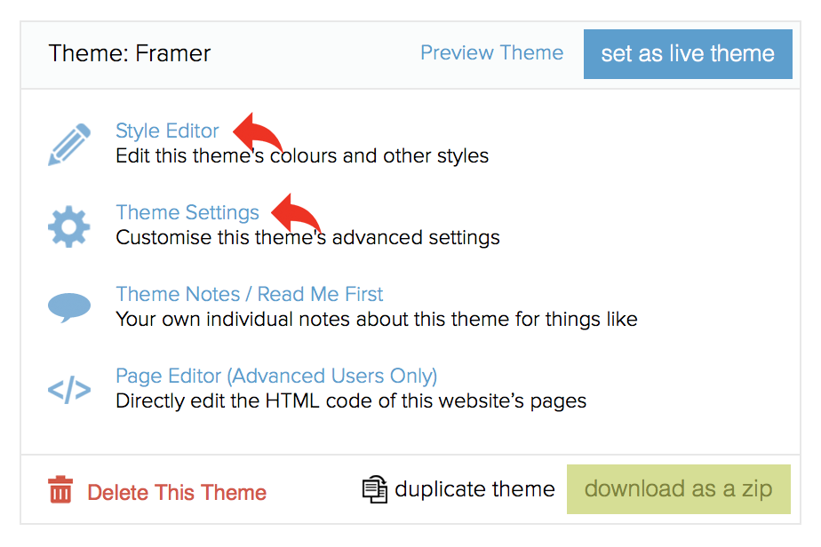
Theme settings are configured using the theme's style editor and theme settings pages.

The editor and theme settings pages are described in more detail in the customising themes help guides.
The file must be valid JSON.
The examples of how to render theme setting content within your theme files assume, in some instances, your use of the standard theme macros.
Setting sections
Common settings (like colours) are grouped into sections.
Sections have the following attributes:
• A title (used to identify the section)
• A description (used to give guidance to the user about the setting)
{
    "title": "Galleries",
    "description": "Choose the galleries to use from your account on your theme.",
    "settings": [
        ...
    ]
}
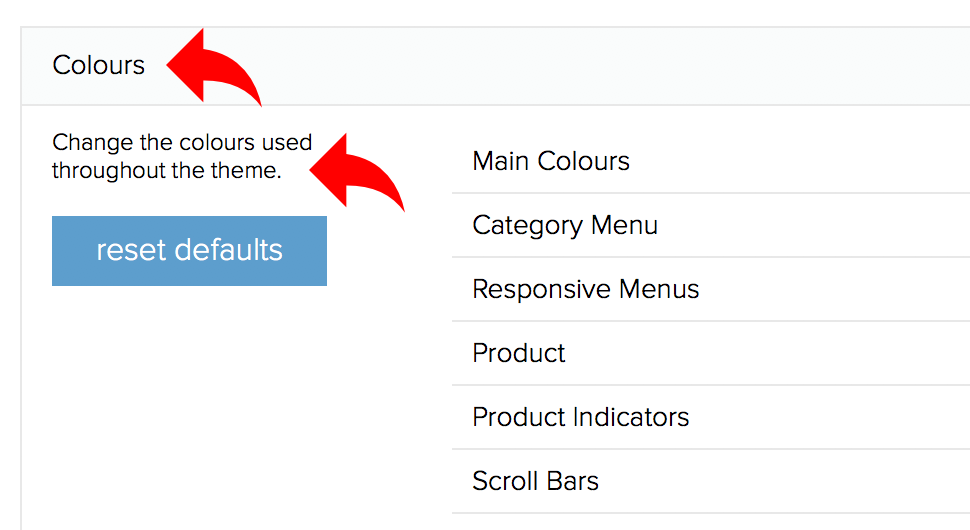
These will appear as shown on the example below.

Optional section attributes
The following attributes are optional:
• Style (if set to double then two settings will appear in a row)
• Advanced (if set to true the setting section will appear on the theme settings page instead of the style editor)
• Resettable (if set to true the user will be able to reset the settings to the defaultValue set)
{
    "title": "Sample Settings",
    "style": "double",
    "advanced": true,
    "resettable": true,
    "settings": [
        ...
    ]
}
Setting attributes
Each individual setting has, amongst others, the following attributes:
• A label (used to identify the setting)
• A note (used to give guidance to the user about the setting)
• A name (used when referencing the setting through twig)
• A type (the available types are listed in the rest of this guidance)
• A default value (used when the theme is installed and if the user clicks the reset button)
"settings": [
    {
        "label": "Main Font",
        "note": "The default is light grey",
        "name": "color_main",
        "type": "color",
        "defaultValue": "#ff0000"
    }
]
Other attributes are available, described below.
Colour settings
Colour settings will display a colour wheel to allow users to pick a new colour on the style editor. Read more here.
{
    "title": "Colours",
    "description": "Change the colours used throughout the theme.",
    "style": "double",
    "resettable": true,
    "settings": [
        {
            "label": "Main Font",
            "note": "The default is light grey",
            "name": "color_main",
            "type": "color",
            "defaultValue": "#ff0000",
            "group": "Color Group 1"
        }
    ]
}
Individual colour settings can be grouped into similar settings by defining a
group attribute.
In the stylesheet, the colour can be referenced as in the example below.
header .search-form {
    background-color: {{ settings.color_main }};
}
Text snippets
Text snippets allow the user to customise small parts of text on the theme. Read more here.
{
    "title": "Text Snippets",
    "description": "Customise the text snippets used throughout the theme",
    "resettable": true,
    "settings": [
        {
            "label": "Copyright",
            "note": "appears in the footer",
            "name": "text_copyright",
            "type": "text",
            "defaultValue": "Copyright © 2017. All Rights Reserved."
        }
    ]
}
These is referenced as shown in the example below.
<footer>
    <div class="copyright">{{ theme.text_snippet('copyright') }}</div>
</footer>
Link lists
Link lists are used to allow a user to manage their website's menus. Read more here.
{
    "title": "Link Lists",
    "description": "Customise the link lists used throughout your theme",
    "settings": [
        {
            "label": "Footer",
            "name": "list_footer",
            "type": "link_list",
            "link_list_title": "Customer information",
            "link_list_position": "In the bottom footer",
            "links": [
                {
                    "url": "/terms-conditions",
                    "text": "Terms & Conditions"
                },
                {
                    "url": "/privacy-policy",
                    "text": "Privacy Policy"
                },
                {
                    "url": "/delivery",
                    "text": "Delivery Information"
                },
                {
                    "url": "/refund-policy",
                    "text": "Refunds & Returns"
                }
            ]
        }
    ]
}
This is referenced as shown in the example below (using a theme macro).
<div class="row column footer-links">
    {{ theme.link_list('footer') }}
</div>
returns...
<div class="row column footer-links">
<h2>Information</h2>
<ul>
<li><a href="/terms-conditions">Terms & Conditions</a></li>
<li><a href="/privacy-policy">Privacy Policy</a></li>
<li><a href="/delivery">Delivery Information</a></li>
<li><a href="/refund-policy">Refunds & Returns</a></li>
</ul>
</div>
Sometimes, you may need to cycle through the links in a link list. This can be done following the example below.
<ul>
    {% for link in global.theme.settings.first_menu.links %}
        <li><a href="{{ link.url }}">{{ link.title }}</a></li>
    {% endfor %}
</ul>
Image galleries
An image gallery setting is used to display a gallery on a particular page. Read more here.
{
    "label": "Sample Gallery",
    "note": "Short Help Note",
    "name": "sample_gallery",
    "type": "gallery",
    "images": [
        {
            "file": "images/samples/banner.png",
            "text": "Optional Text",
            "url": "optional-url"
        }
    ]
}
This is referenced as shown in the example below.
{% set images = global.theme.settings.sample_gallery %}
{% if images %}
    {% for image in images %}
        <div class="slide">
            {% if image.target_url %}
                <a href="{{ image.target_url }}">
                    <img src="{{ image.url }}" alt="{{ image.name }}">
                </a>
            {% else %}
                <img src="{{ image.url }}" alt="{{ image.name }}">
            {% endif %}
            {% if image.name %}
                <div class="overlay">
                    {{ image.name }}
                </div>
            {% endif %}
        </div>
    {% endfor %}
{% endif %}
The file attribute is used to set default image(s) that will be installed when the theme is installed.
Platform settings
Some settings are defined on a theme but work at a platform level.
Items per page
{
    "title": "Items Per Page",
    "resettable": true,
    "style": "double",
    "settings": [
        {
            "label": "Products per page displayed on category pages",
            "name": "items_per_category_page",
            "type": "text",
            "defaultValue": 8
        },
        {
            "label": "Products per page displayed on search pages",
            "name": "items_per_search_page",
            "type": "text",
            "defaultValue": 10
           }
    ]
}
The items per page settings determine how many items are displayed on each page of results on category and search results pages.
Offline payment
{
    "title": "Offline Payment",
    "description": "Only allow trade customers with credit accounts to be able to checkout with offline payment.",
    "advanced": true,
    "settings": [
        {
            "label": "Only Trade Customers With Credit Accounts Should Have Access To Offline Payment",
            "name": "require_credit_customer_for_offline_payments",
            "type": "checkbox"
        }
    ]
}
The offline payment setting displayed above will restrict the offline payment method to only be available to trade customers who have been allocated with credit accounts. Read more here.
Orders per page
{
    "title": "Orders Per Page",
    "description": "Specify the number of orders shown per page on the account/home page of a registered customer's account.",
    "advanced": true,
    "settings": [
        {
            "label": "The number of orders shown per page",
            "name": "orders_per_page",
            "type": "text"
        }
    ]
}
The orders per page setting will restrict the number of orders shown on the account/home page of a registered customer's account (when they are logged in).
It can be used if you have customers who have a large number of orders.
The following variables are available.
{{ current_page }}
{{ total_pages }}
{{ order_count }}
{{ global.theme.settings.orders_per_page }}
Checkboxes
You can create a setting with a checkbox as shown on the example below.
{
    "label": "Sample Check Box",
    "name": "sample_checkbox",
    "type": "checkbox",
    "defaultValue": true
}
This is referenced on the theme as shown in the example below.
{% if global.theme.settings.sample_checkbox %}
    <p>This message will be visible when the checkbox is ticked.</p>
{% endif %}
Drop Down List
You can create a setting with a drop down list of options as shown on the example below.
{
    "label": "Sample Drop Down",
    "name": "sample_drop_down",
    "type": "drop_down",
    "defaultValue": "2",
    "values": {
        "1": "One",
        "2": "Two",
        "3": "Three"
    }
}
This is referenced on the theme as shown in the example below.
<p>You selected {{ global.theme.settings.sample_drop_down }} from the dropdown list.</p>
