Logo shapes
Logos come in all different designs. Essentially though, logos are either square (where the width is the same as the height), landscape (where the width is greater than the height) or portrait (where the height is greater than the width).

The graphic above shows a portrait shape gradually changing to a landscape.
In website design (for desktop computers that have landscape screens), vertical space (i.e. height) is in short supply, particularly at the top of a website. This problem is demonstrated quite well with the above graphic. The shape on the far right has a much greater area than the shape on the far left, but both have the same height.
The problem is exacerbated by the fact that when text is placed on a logo it too is landscape.
So if the shape of logo that you upload is square or portrait, it is going to appear much smaller than a logo that is landscape.
And if your logo is square or portrait then making it bigger is going to mean that content is pushed down the page.
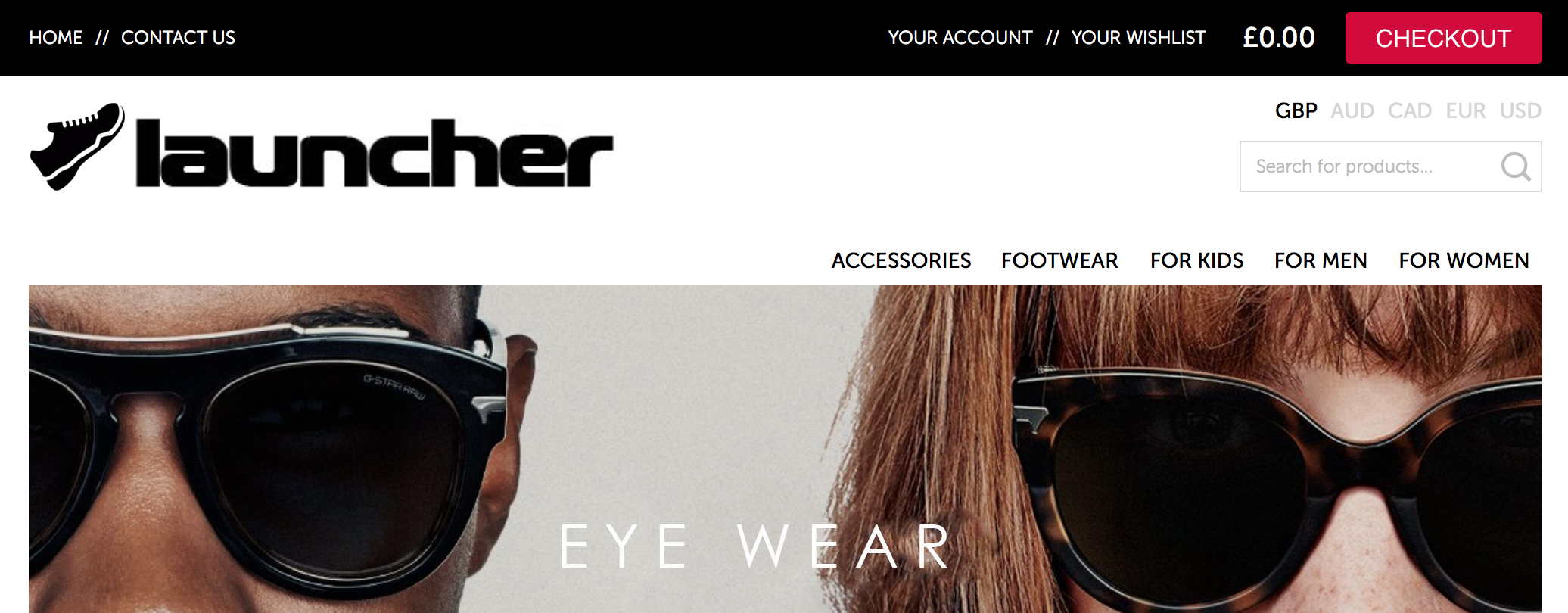
Consider the following example.

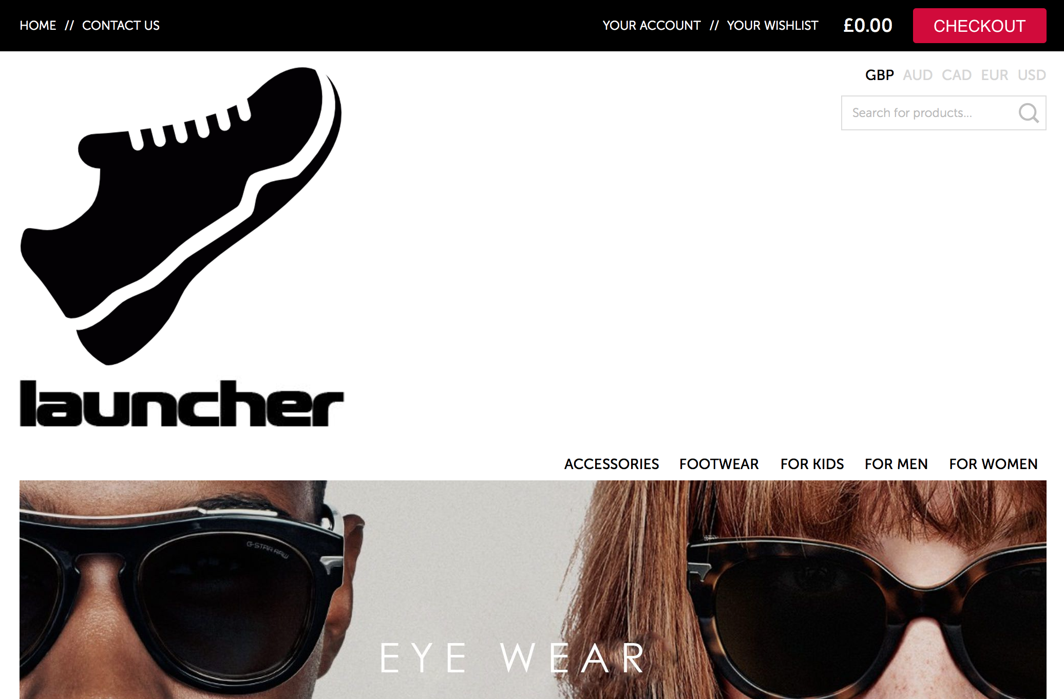
Now consider it with a square logo

If you wanted the words 'launcher' to appear the same size as they do on the first example the height would have to be much bigger.

Where possible, we always advise uploading a landscape version of your logo or adapting your logo to make it either landscape or square. We can assist you with this if you need us to.
